
Mikkeller-Keith Shore: A Crucial Aspect of a Beer’s Success
Up to now we’ve devoted one post to an aspect which at first glance would seem only secondary in the craft-beer world – labels and their design. As we noted on that occasion: “Just look at a beer shelf and you’ll immediately see the difference between old and new productions.”
I mentioned the aesthetic role played by Colin Healey, Prairie Artisan Ales’ designer. Keith Shore’s role is even more significant, I think — if only because of the global success of Mikkeller (Copenhagen, Denmark), with whom he collaborates. Mikkeller exports to 40 different countries, and Mikkel Borg Bjergsø is seen as one of the most innovative brewers of his generation (see this post, for example).
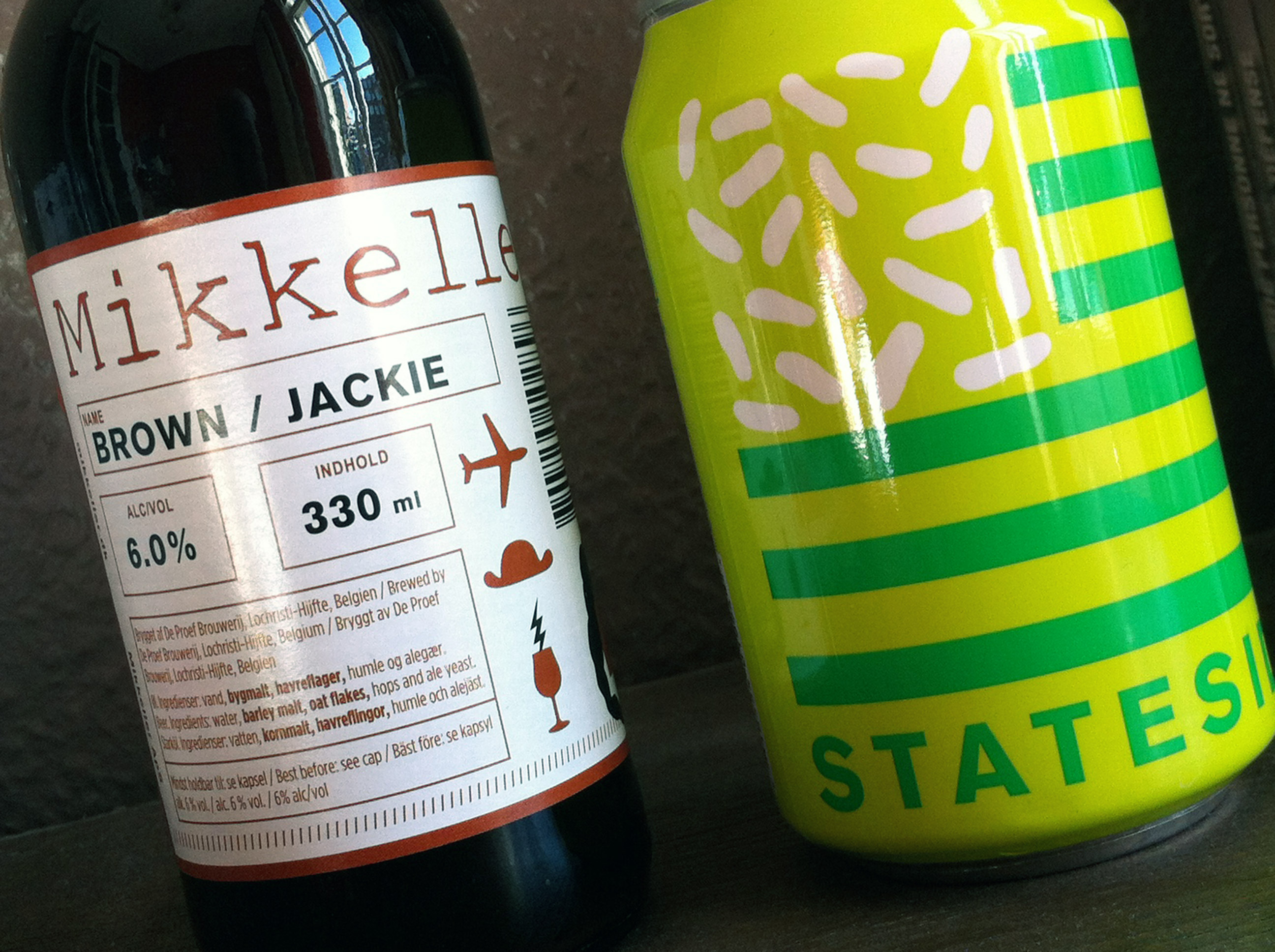
As art director of this gypsy brewery – though he’s based in Philadelphia (Pennsylvania, USA) –, Shore has undoubtedly helped Mikkeller promote a good image. His highly coloured, weird, narrative labels create an instant impression. “I rely on my characters and colors to tell the story. Of course, typography is important, but in the labels for Mikkeller it typically takes a back seat,” he says.
But I’ve chosen two labels that are a little outside this standard to illustrate my point. No character, no story; one label almost seems lifeless, the other is very vivid. And yet we can still spot the artist’s work…
The collusion of this collaboration between Bjergsø and Shore is undeniable, patent. With this limited palette and immediately recognizable look, a Mikkeller bottle stands out among the crowd of beers produced nowadays. Even before knowing what the beer itself is like, we’re attracted. And voilà!
Of course in the end it’s all communication strategy. But in this case it’s clear – if we can put it this way – that quality is working for quality. Keith Shore has built a visual identity for Mikkeller, one that’s perfectly in line with the gypsy brewing style. A remarkable win-win deal to guarantee success!